I’ve just released my new game. Yes, yes, yes. There is nothing better than this moment and it’s always a brief time for celebration. No matter how big my game is, there is nothing more satisfying then getting it finally out. I want to share some quick summary of what I did correctly, what I’ve learnt and what I can improve.
Background
The game is based on a silly game we play with my partner when wandering through streets of Brussels. It has a silly name – Punch Buggy. Yes, if you remember an old episode of The Simpsons, you know what I am talking about.
Development cycle
I made an initial code Git commit on March 18 and finished on April 26, 2021. So, something around 5 weeks of not that intense development. Plus, I have to admit I didn’t work on the game entirely for a several days.

Description
The game is basically an endless runner game. You are a small car driving on top of a cylindrical world which is spinning around. In the world there are spawning some blue cars which are your targets to click or tap on. Successful tap = increased score and a little bit of experience progress, leveling up means the world accelerates.
Besides blue cars there are generated bonuses – modifiers of the world which can help you, change visuals or gameplay. Moreover, from time to time, you will encounter some obstacles in your way, and you will have to avoid them.
You are starting with 60 seconds, when you run out of time the game ends. For clicking on blue cars or specific modifiers you get additional time bonus, obstacles do the opposite, they slow you down.
Game design
As a proper newbie I entered the development phase with minimum pre-production resources. Neither game design documentation nor brief pitch one-pager describing game mechanics, estimating scale or assets needed.
I know it is important to have a proper plan in order to avoid constant iterations. However, with my current projects scale I am torn between being efficient and doing things right (developing documentation takes time). I started the project in Unity knowing I want to make a car which goes through a world and a player needs to click on spawned objects. Nothing complicated, maybe even too simple. Obstacles and modifiers were added over time.
The controlling scheme is very simple in order to make it satisfying on mobile devices. When I added obstacles and ability for car to switch lanes, I experimented with an on-screen button control. After several tries, I decided to make it more touch screen friendly so you can click everywhere. It added a bit more work on my end, but it plays better (interface for interactable objects, several changes to collider sizes).
Style, graphics & music
After several 2D games I knew I definitely want to try something in 3D. I have (as probably every indie developer) several graphic sets from Humble Bundle, one of them is low poly model of a city by Synty Studios. Quiet generic, but also universal and can be utilized in many projects.
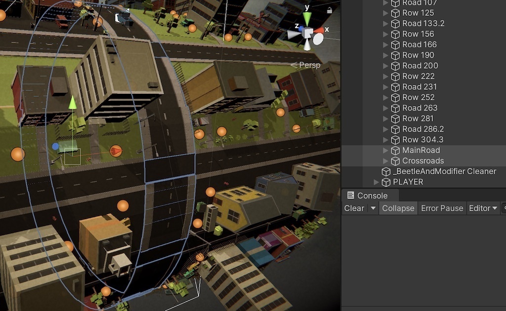
I’ve decided to spice things up and organize the town around a cylinder object. It ended up being rather challenging and I’ll admit the final circle is not exactly a circle, but rather several angled platforms. Relatively late I started building a perpendicular road that our player’s car is riding on. It added so much to the environment and it looks better than I expected. Very important was to keep everything organized, see surrounding screenshots with your own eyes. I grouped all rounds with number signifying rotation x of the cylinder. It allowed me to spin the cylinder to position where center is on vector zero position. Thus, expanding with a new aligned object is just adding it to vector zero and subsequently parent it under the currently edited row. I am glad I kept it tight until the end as it saved me some nerves around organising.
2D graphics
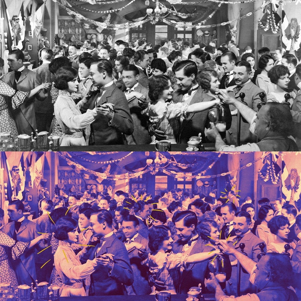
For menus I decided to go very, very subtle. The graphic assets reminded me old cars, so I decided on stylization to 20s or 30s look; black and white colors, typewriter font and backgrounds reminding silent movie titles. It’s very minimalistic experience, but I hope it works and looks fine to others. I am very happy with old timey photographs that I “colorized” a bit in Procreate and used them for sliders in loading screen and options.
This jazz age style took me just a few steps further in music inspiration – an old royalty free music that reminds me O Brother, Where Art Thou?.


Coding
Yeah, I won’t be pretending I am an expert. I am proud of myself for improving every time and repetition gets me better (just in different pace). The game itself doesn’t require complicated calculations, just usual “Unity code” – a lot of transform manipulations, instantiations, etc.
I am still far away from C# proficiency I would like to master, however, every single time, I add something new to my utility belt and improve previous skills. If I compare my previous games, I have more confidence when using events, abstract classes or interfaces.
First time I actually properly implemented a state machine pattern. Great thanks to Patryk Galach and his blog. Interestingly, in my previous two games, I controlled UI via something reminding a primitive state machine. It was DIY, junky and mainly inefficient but I am still a bit proud tha my “creature” wasn’t that much far from a proper state machine.
On top of that, this is the first project I forced myself to use Visual Studio Code. Previously my IDE of choice was Visual Studio, but for this game I switched to VSC. Especially Github integration is fantastic, and I already love it. I still think I’m faster when using Visual Studio but learning VSC is a good investment for the future.
Read, in Czech, about my favorite YouTube Unity channels
[Bad Things] What I’ve learned and need to improve
- Environment creation can be very time consuming. Be smarter. Try generating it more randomly and work with grid-based layout (rotation is still my enemy).
- The environment is way too static, there are only a few moving objects around and the world looks lifeless.
- Canvas scaling on different screen sizes – I really thought I got a hang of it, but I ended up with rebuilding many things.
- More testing. Don’t underestimate it. Especially when releasing on multiple platforms.
[Good Things] What to build on next time
- I’ve accelerated templates and process around store listing – I can create decent screenshots and icons relatively quickly. Itch store also looks more polished.
- I do much more Git commits; process is faster and I can easily revert to previous versions.
- Some coding techniques I feel more comfortable with now – abstract classes, interfaces, state machine pattern.
Platforms
I released the game on Android on Google Play Store and Windows, Mac and HTML builds on itch.io. I believe the most enjoyable is playing the game comfortably with your mouse.
Plans
At the moment I am writing this text, I don’t have a full idea what the next project is going to be but inspiration is all around us.
I know though, that with my next game I want to:
- Write game design document (even short) before starting the development
- Get more feedback
- Try one of new systems in Unity – UI or input
And this is the end. I can only ask you to try the game. It’s for free, available in Google Play store and on Itch.io store.
Have fun and share feedback with me.


Happy to see that my blog is helping people a little bit! 🤓
Pingback: How to Play Punch Buggy: Rules and Tips - Info Welt